The Mentor Method
Background
The Mentor Method was purchased without design files. We had the code, the original development team and exported pngs of a selection of the screens. With a fully build application and active clients, we were starting from scratch.
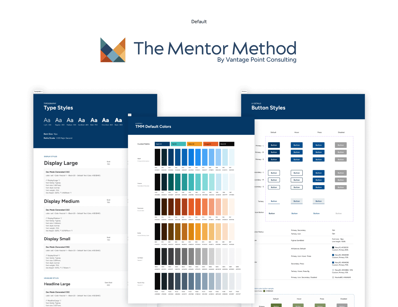
As a first step, I pulled colors used within the application. I went through screenshots and began to slowly map out where we were starting.
My Role
As the sole designer on The Mentor Method initially, I lead and drove this process.
The Problem
Our problem was complex. We were not just lacking a design system but the foundational branding and vision needed to build the future of this application. Simultaneously, we had a product with active users which included admin and custom branding. Both the custom color and existing branding lacked accessibility considerations.

Research
For the branding, I went through a long explorative process. I met with developers and data scientists, conducted user interviews to understand how The Mentor Method fits into their mentorship experience, and did my own deep dive into the stages of mentorship to get a complete grasp of what needed to be built.
Our Solution
We knew that the process would need to be incremental.
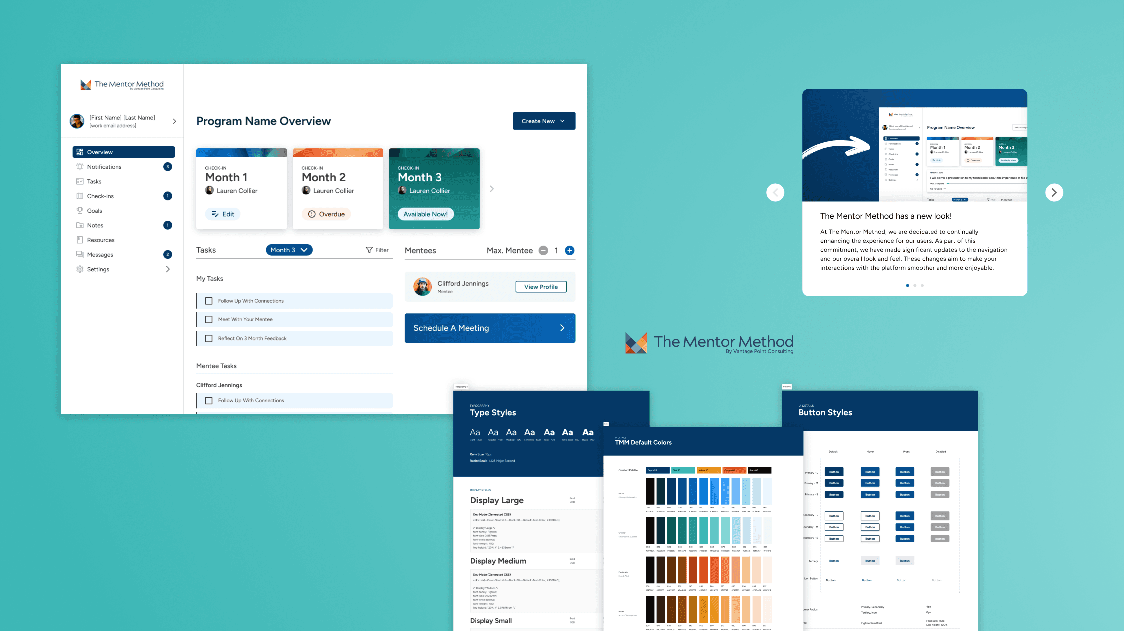
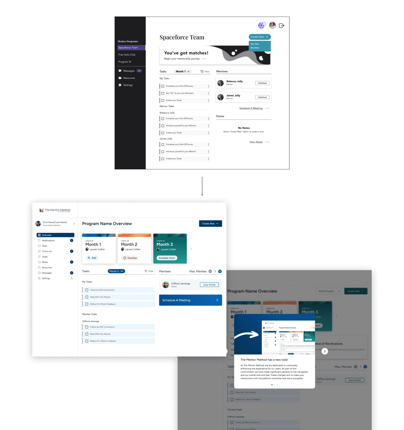
I began by slowly improving what currently exists by adjusting the colors and their usage. I recreated common elements as components in the UI using the principles of atomic design.
Before we could reach the next level, we had to begin crafting the vision for this project. I lead multiple visioning sessions with our project manager, product owner and our technical lead.
Ultimately, I decided based on the improvements made to the product, our vision, our future goals for the product and the competitive landscape of mentorship software that we needed to convey product maturity and confidence that - quite frankly, were not quite there yet. Our branding had to be forward-looking to capture everything we hoped to become.

The bigger challenge was our design system. At this time, my experience with design systems was limited. Such a massive pivot, especially with the state of our code, created both design and development debt that we've been slowly working through as we refactor. The transformation of the product has been both internal and external as we reach higher states or parity between the code and the design.
As part of the process, we switched to a modified Material UI to expedite development and deliver improved experiences to users faster. Material was was already one of the UI kits the original team used before we purchased and their color and type guidelines were already the framework used to create our color and typography styles so the transition has been very smooth.
Challenges
This project forced a lot of growth in my own skillset. The complexity of components from it's first iteration to today are impressive. The need for a design system that was easy for to adopt, flexible enough to foster creativity, but rigid enough to force consistency was really highlighted as junior and peer designers were brought on and off the project.

Future State
These enhancements to the branding and design system are still a work in progress - they will evolve and grow with the product. In the future we have plans to develop the illustration style of the product and continue to make the design system easy adopt, easy to learn and flexible. Additionally, we removed the custom color option in favor of prioritizing accessibility. Accounting for our broken color customization in design and code was an added layer of complexity we couldn't sustain.
We hope to bring it back in future iterations of the product.


